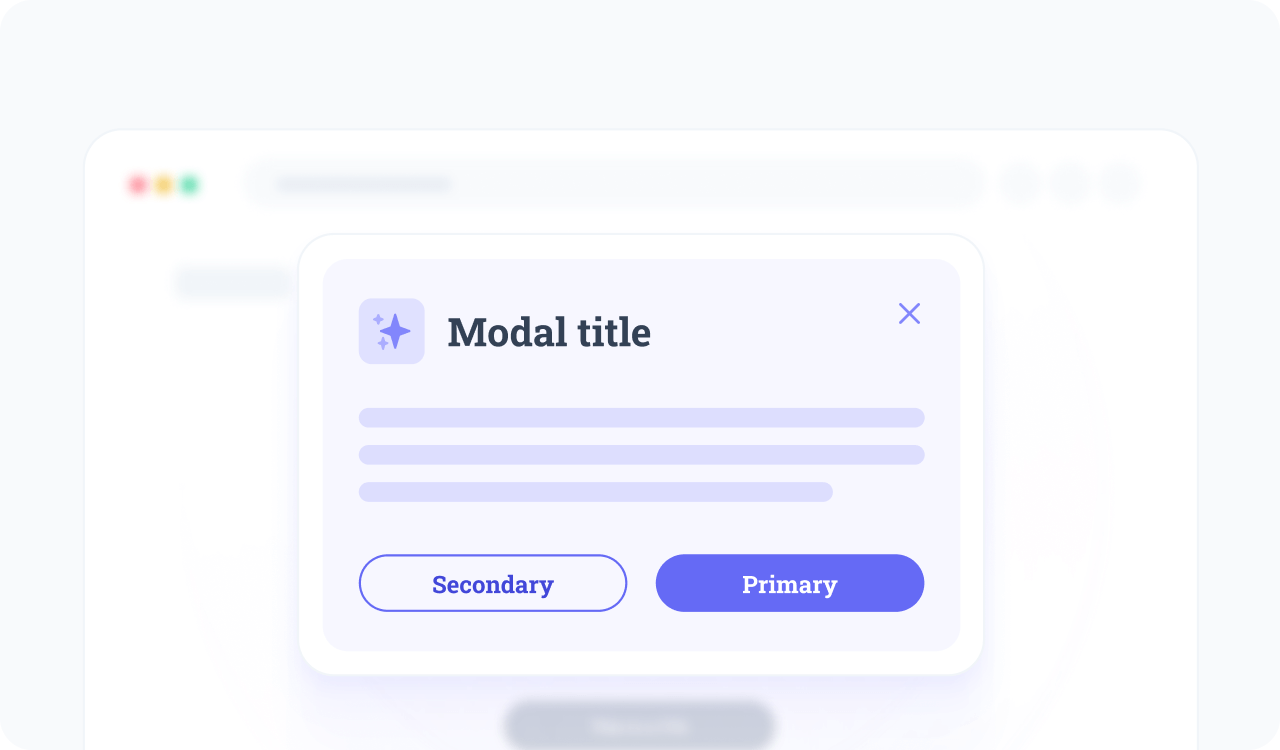
Modal dialog
Schema-only template for a modal dialog component.
Introduction
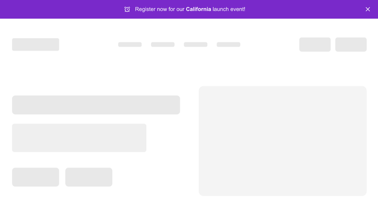
A modal dialog displays content in a focused overlay above the main page.
Commonly used for forms, confirmations, alerts, or additional information and designed to interrupt the normal flow, it centers the user's attention on a specific task.
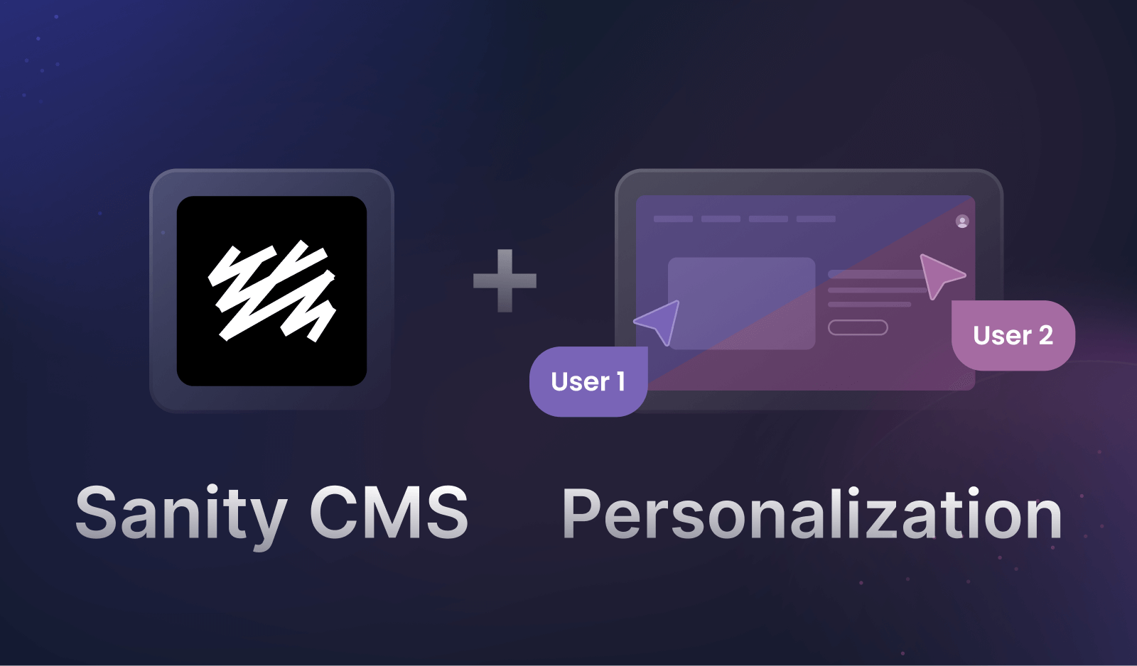
Personalizing the modal content, such as showing tailored offers, messages based on user behavior, or dynamic forms, and AB testing variations in timing or copy, can increase relevance, reduce friction, and improve conversion rates.
Need the code?
Explore popular React modal dialog libraries in our guide.
Usage
To add this component to your workspace, run:
npm
npx croct@latest use croct://ui/component/modal-dialogExplore or help us improve this template
Other templates using Croct
Croct
Croct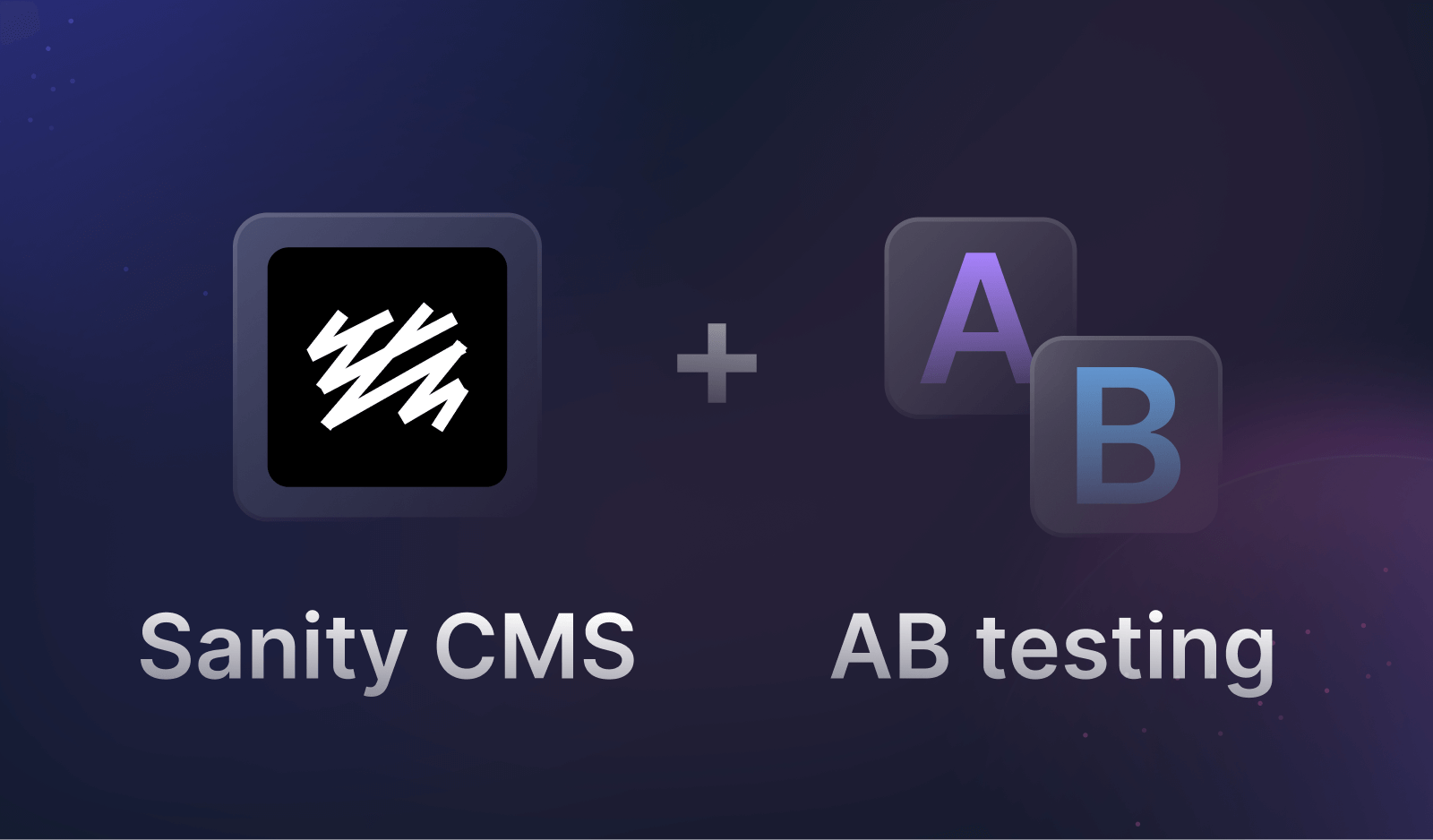

Start building in seconds
Paste the following command in your terminal and let the CLI do the rest.
npx croct@latest use croct://ui/component/modal-dialog